Work
This project was very close to my heart as it had travelling at it was the very first project that went live and made a difference in the real world. goSTOPS already had a basic website and mobile application. My role there was of a UI/UX designer and along with it establish a visual language and uniformity. I started with redesigning the food section of the mobile app. Next was the website.
The food app was required for -
Hotel guests staying at goSTOPS across India
Seamless user experience, and thus,
A smooth flow
To induce the excitement of food ordering
Also at the same time reducing the number of clicks
Showcase all the food items and offers
At this point there was negligible user data. So, I started my journey by interacting with the guests around, testing assumptions and researching the competitors platforms. After multiple inputs from guests, manager and reviews on google, play and app store I moved on to wire framing. With a satisfactory structure in hand I then started the next step of materialising it.
This revamp helped increase the food revenue increase by 20%. I learnt how immersive and impactful visual design can change the brain's analysis.

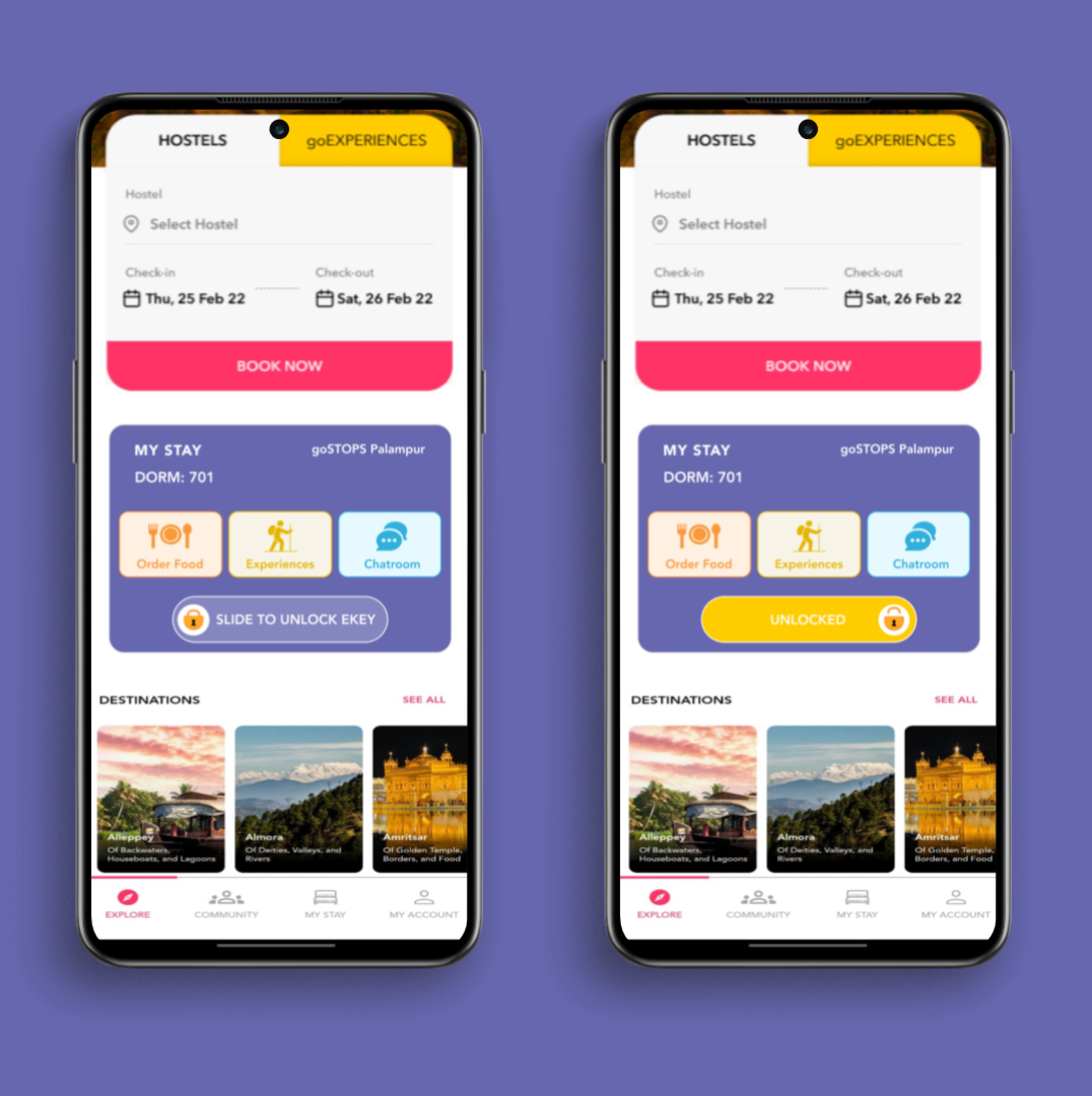
goSTOPS was using TT-lock app to allow guests access their room doors through phone. I suggested and implemented the idea of having the lock/unlock door feature in the goSTOPS app using bluetooth.
Website Design

Previously, the user interface featured separate card components for the same room but with different services (e.g., room only, breakfast+room, room + breakfast+dinner). This approach not only occupied a significant amount of space but also resulted in a considerable amount of scrolling for users navigating through the options.
In response to this,
I've streamlined goSTOPS dorm booking by consolidating different services for the same room into a single card component and ensured the design doesn't change for different services. This change reduces clutter and minimizes scrolling. I added a collapsible feature and a user-friendly calendar for easy date management. These improvements aim to enhance the user experience.


